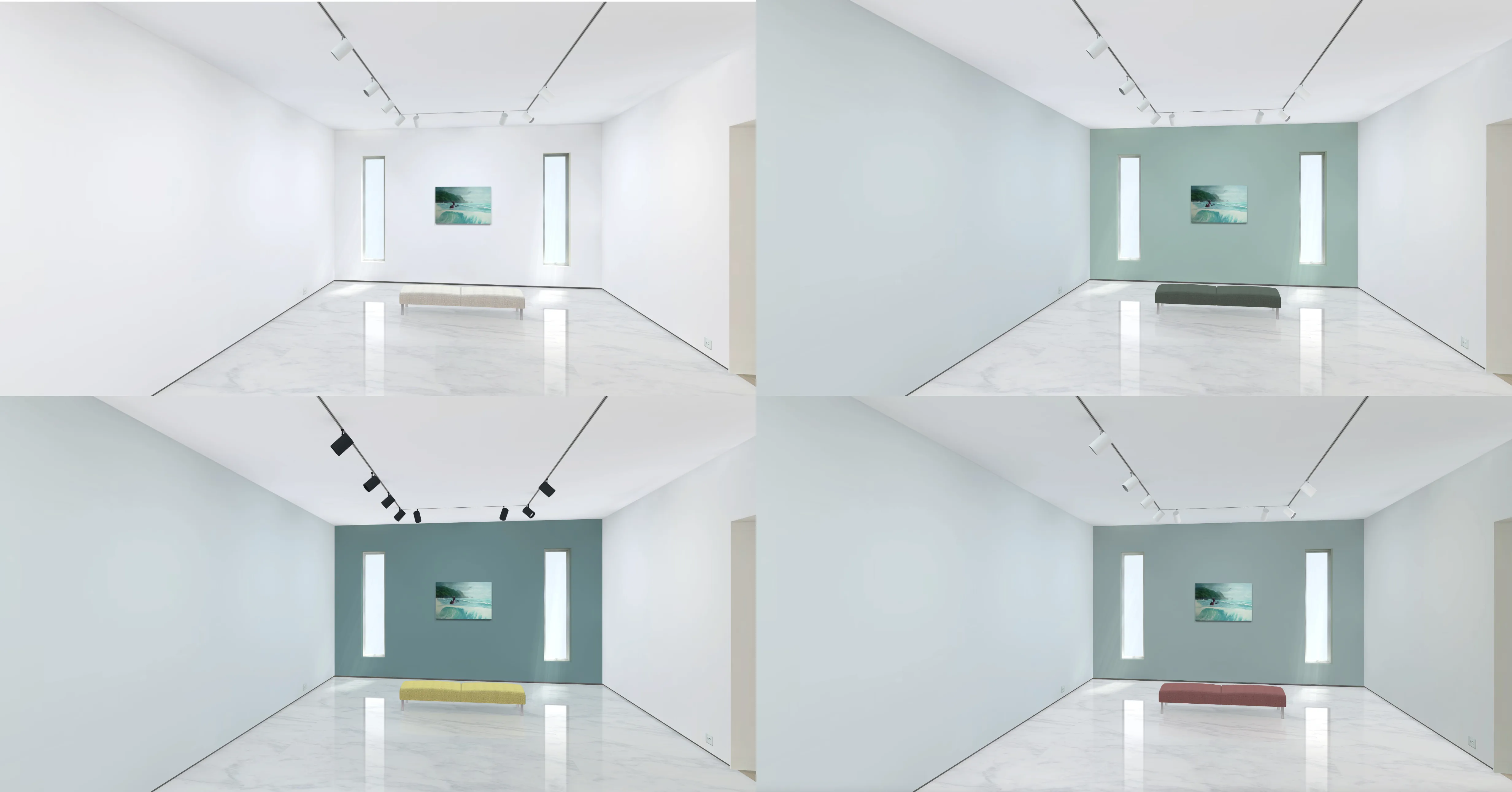
One of the joys of a virtual gallery is the way every surface can be coloured with a simple click. It’s a lot easier than spending the day up a ladder transforming your bricks-and-mortar space. That said, there are some tips to keep in mind when choosing colour schemes for your online space.
A single wall can be coloured to set-off a hero artwork, or the entire gallery can be subtly tinted. There are infinite possibilities for customising the look of your gallery space. Just like in reality, the colours in your gallery can have a powerful effect on the artworks they present.
Think about how you can create a mood using all the aspects of your virtual gallery – the walls, doors, windows, lighting rig and even the bench seats. Being able to re-colour these surfaces provides more control over your exhibition presentation.

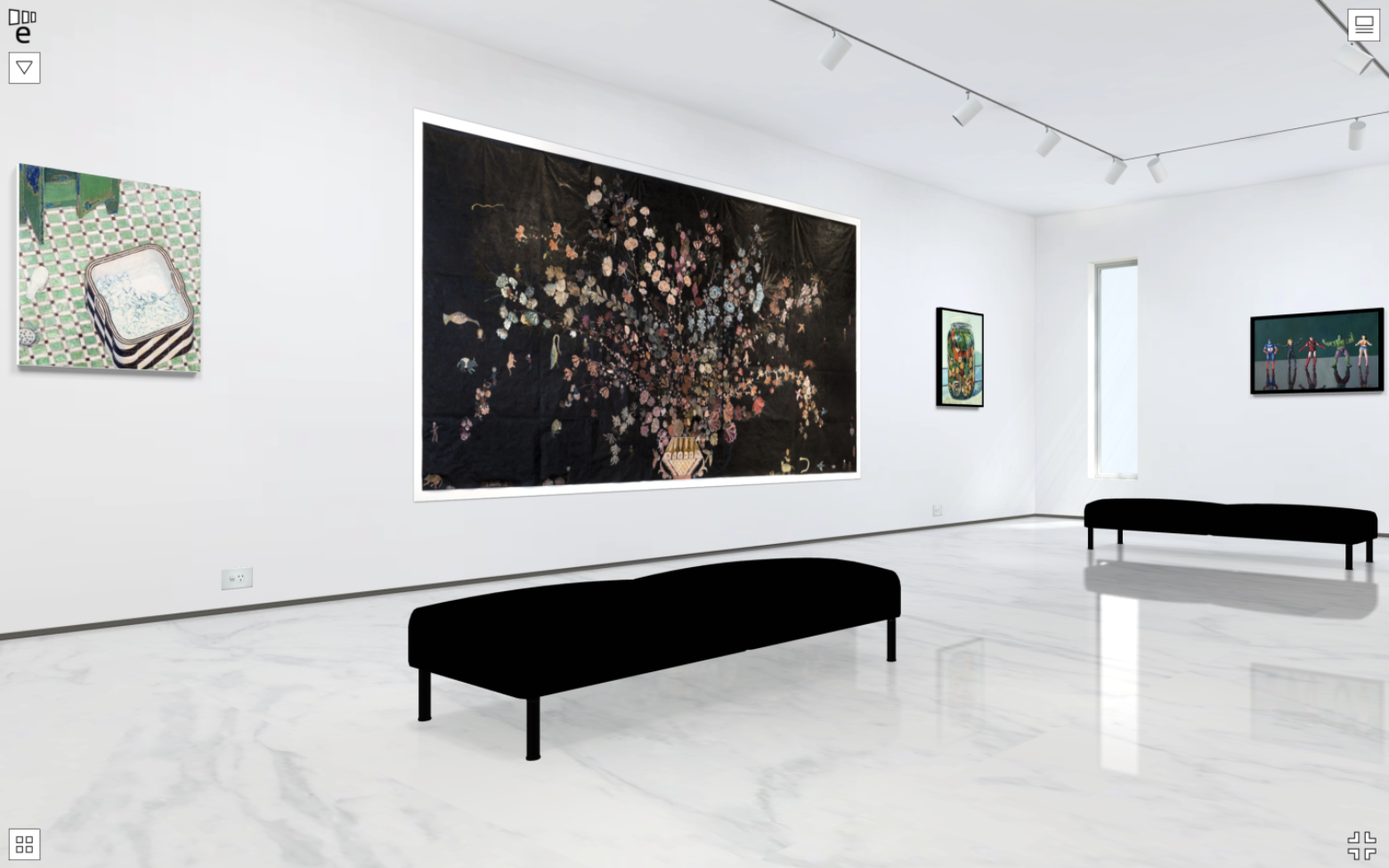
There’s nothing wrong with rich, dark surfaces, especially if you want to break away from the white cube look. However, it’s a good idea to be careful when selecting really dark tones. Although Exhibbit lets you colour most surfaces until they’re almost black, beware of making them so dark that you can’t see the shadows rendered into them – particularly the walls. This can ruin the realism of the gallery. However, a darkened space can truly set off a video work if needed.
Exhibbit has been designed with a palette of options that let you render almost any gallery environment – from traditional to post-modern. As artists ourselves, we wanted to give curators a way to showcase art to the best possible effect.
We provide the palette – you set the stage, and create the occasion.
