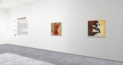
We’ve designed Exhibbit to be realistic (like a bricks & mortar gallery) but easy to change (unlike a bricks & mortar gallery). So, when you are curating, each wall can be treated like a page of a website where you can place images, along with supportive text, graphics and video. All walls and fixtures can be recoloured and when the exhibition has been published, your viewers are able to easily move around the virtual gallery and have their own experience of your exhibition, just like they would if they were there in reality.
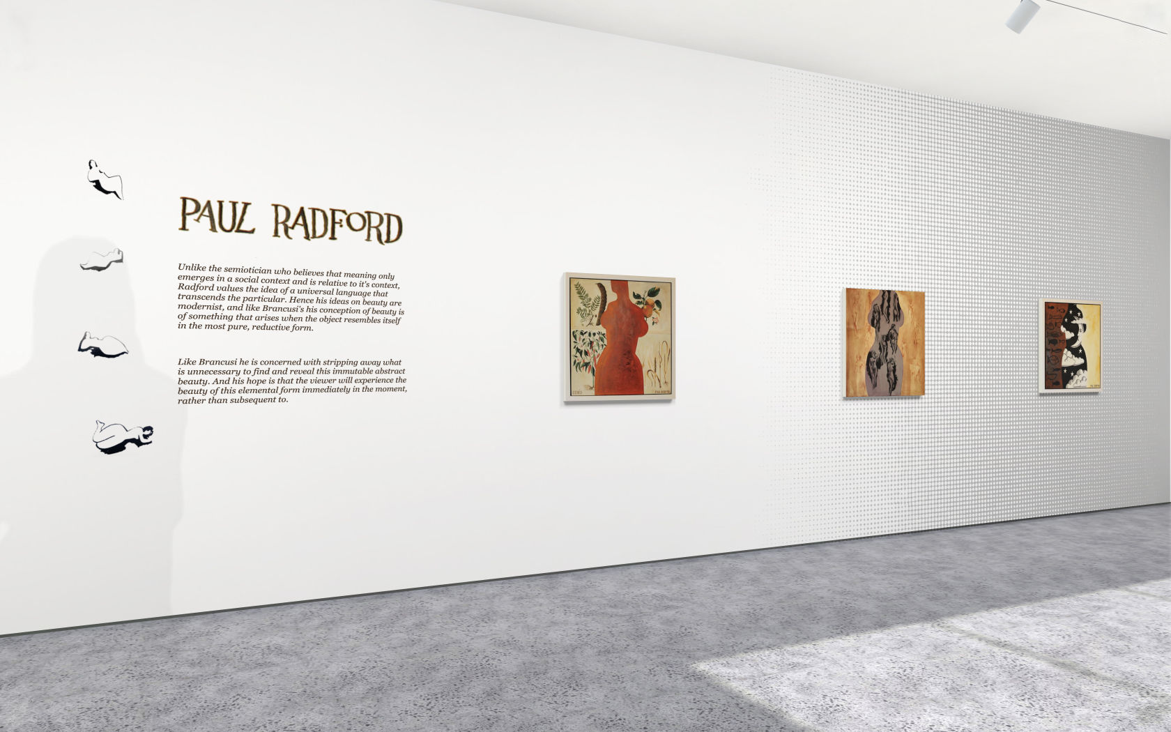
There are a selection of fonts available for placing your exhibition title and abstract on the wall. Graphic’s with a transparent background (.png’s) can be placed under artwork or text to create a pattern or texture on the wall. They can be wall sized to create a wallpaper effect and also be smaller images like a special title or to place the artists signature on the wall.
You can brand the gallery by placing your logo anywhere on the walls. Images containing transparency are saved in the .png file format. When you upload a .png into Exhibbit the software will detect if the file has transparency and remove the artwork framing tools, presenting you with just the size control. When your .png image has transparency the gallery wall shows through in the transparent areas.
There is a large variety of source imagery online that you can use ‘as is’ or with some additional input from paint program compositing and effects. For examples of files containing transparency search for ‘.png background images’
If you find a design or image you like, that doesn’t come with transparency, you can add transparency by using a mask in a paint program. There is lots of tutorial support for creating masks available online. Here is an Affinity Photo - Mask Tutorial
Exhibbit is a wonderful design tool for creating multiple concepts in a short time. You can try out different hangs and design ideas very quickly from your desktop.
This is very useful if you are planning to simultaneously stage your exhibition in a physical gallery as well as your virtual gallery space.
Think of your Exhibbit gallery as a space to refine your designs. To collaborate with others at this stage, share the exhibition privately by inviting interested parties to view your published exhibition.
If you want to use a particular font for the exhibition title or gallery name, and it’s not available in Exhibbit, then Graphic’s are the way to achieve this. An artist’s signature or other graphics that support your presentation can be added as .pngs.

The graphics in the image above have been created from the artwork on paper by photographing it, then uploading to a program like photoshop, where you can mask the text and remove the background. If you would like to try this yourself, we’ve made a step by step guide here.

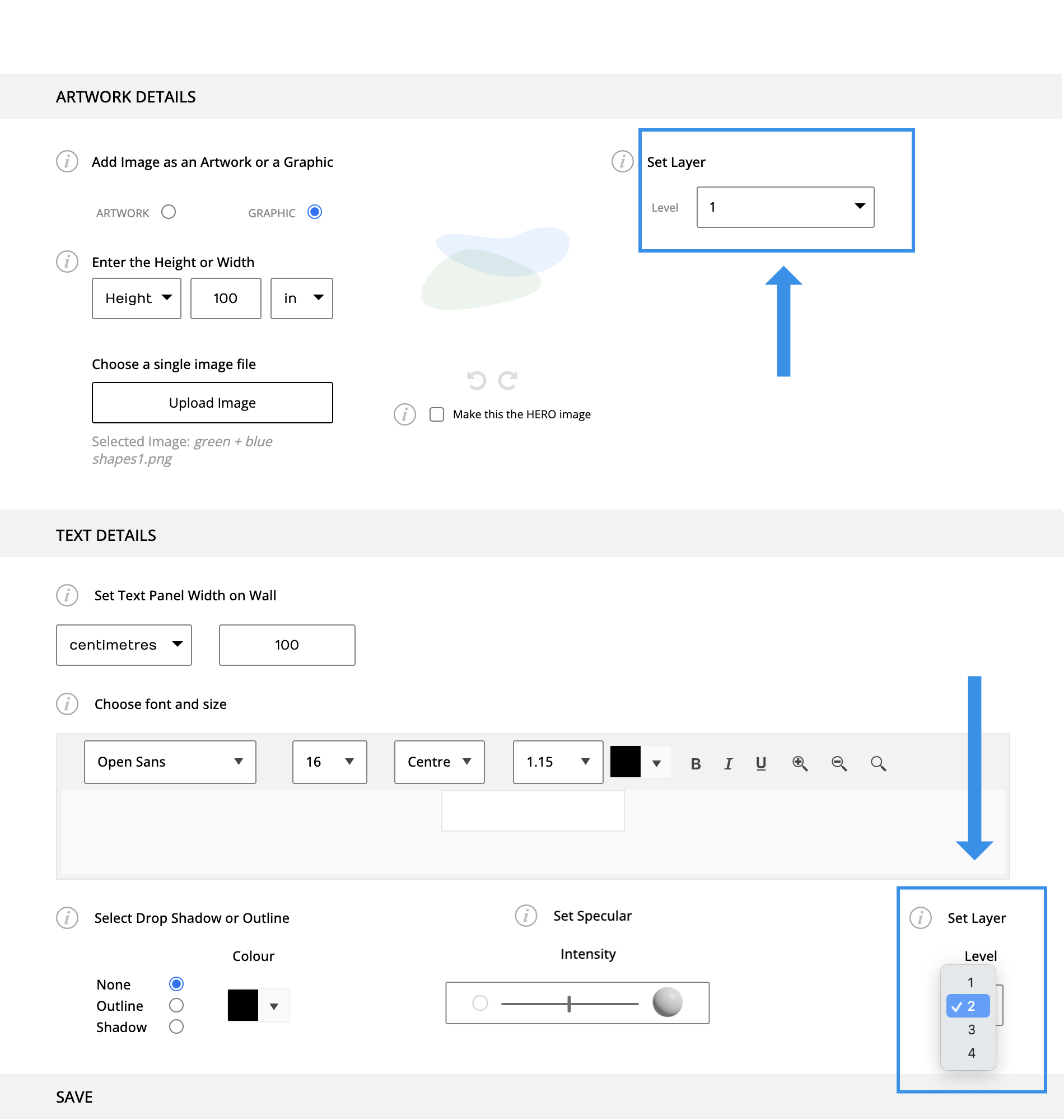
When arranging your exhibition design elements, always keep artwork on level 4, above your graphics and text layers. To overlay graphics, text and artwork, keep each element on a seperate level with the artwork on top.