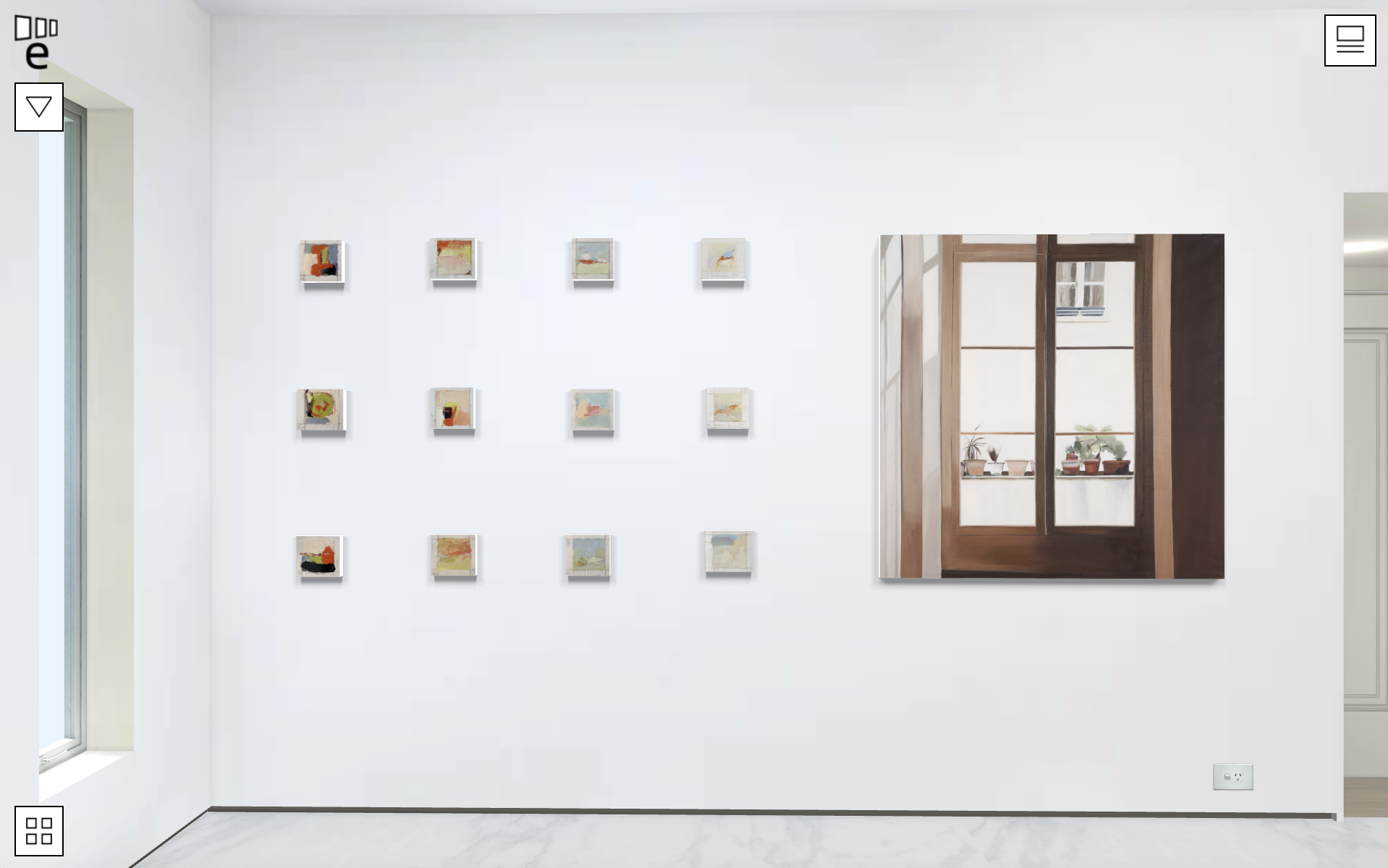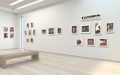
The new responsive display means your gallery window will scale to whatever aspect or size the browser page is set to. If you have a website that needs a specific embed size, a custom height and width can be added. No matter how big or small, your gallery will fit perfectly.
As the curator you have ultimate control over the design and styling of your exhibitions. Exhibbit supports many kinds of curation styles with no limit to the number of artworks in an exhibition. This freedom does however come with some considerations. Salon style hangs with artworks across the entire wall take longer to load. We recommend that loading times are tested before publishing your exhibition.
If you would like more space and faster loading times, consider spreading your exhibition across the five exhibition spaces available.
TIP: If you have a handmade or ornately styled frames, these can be well represented by photographing the frame along with the artwork, then colouring the sides of the canvas to match, like the example at the end of this article.
We’ve added four navigation buttons in bottom right hand corner of the screen. The full screen icon has been re-located to the menu on the left hand side. These buttons don’t replace, but augment the keyboard and/or finger navigation by replicating the controls. The navigation buttons can be used in addition to your own keyboard, mouse or trackpad.
The navigation and menu can be reduced by tapping the top menu button. This hides the on screen arrow buttons and reduces the menu, leaving the screen clear to navigate around the gallery. The tour at the bottom toggles on and off from the button in the corner.
The interactive wall buttons beside each artwork animate out in sync with the artwork label, which fades into view as you move closer.
The label beside the artwork is clickable, moving your view closer to the wall buttons, where you tap to enquire or purchase.