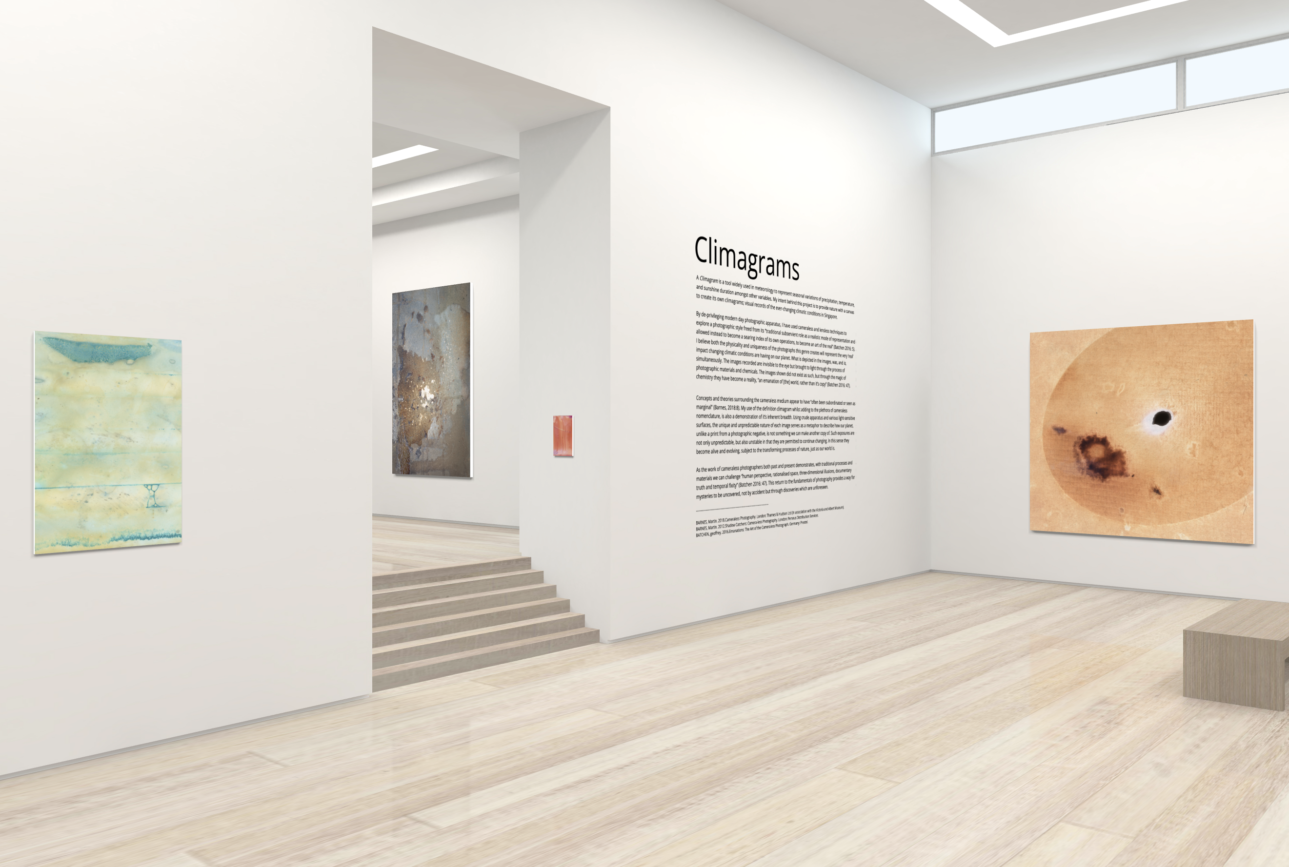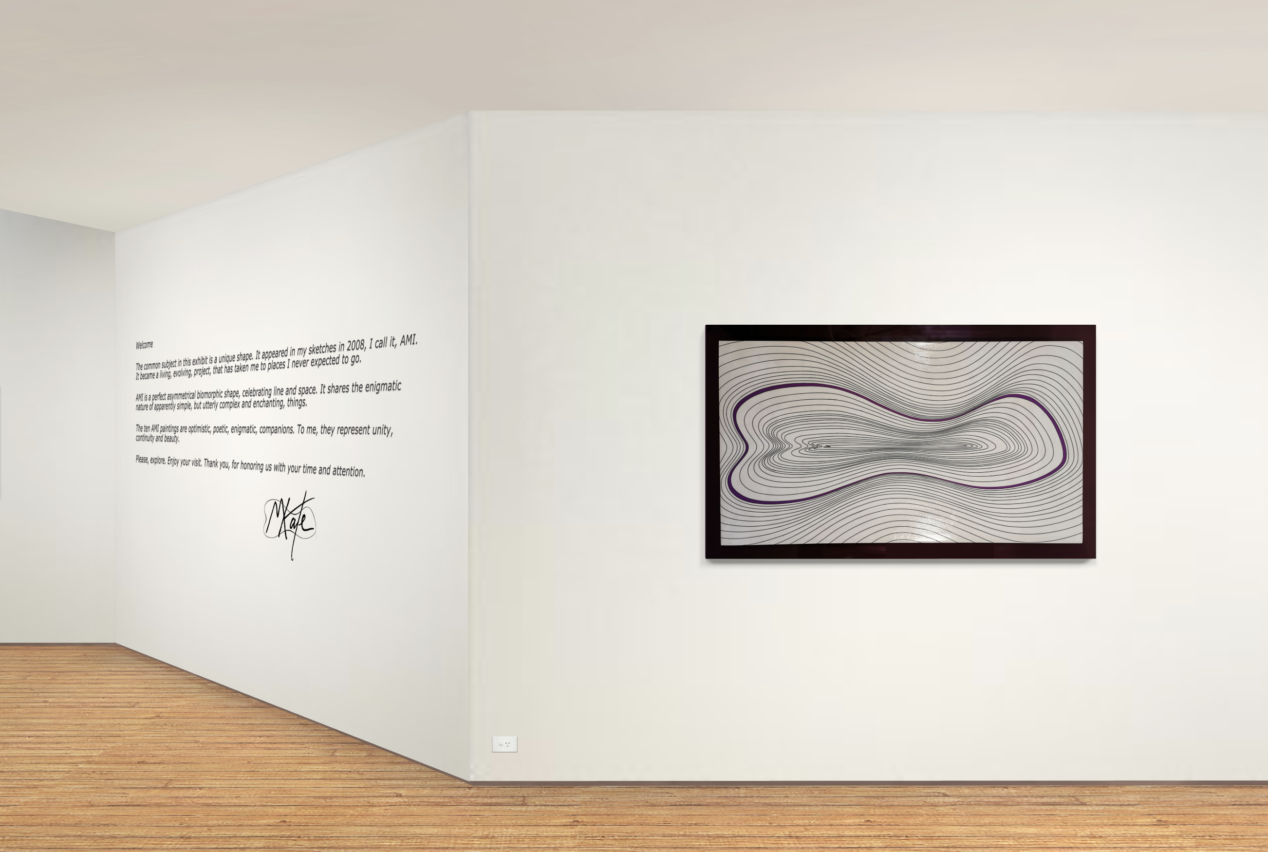
Using Exhibbit, use wall text as you would for a physical show - but instead, dragging and dropping it anywhere on the walls. This feature comes with a range of fonts and styles. Titles and paragraph text can also be created at any size.


Features of wall text
Text can be added at different sizes, and also with different qualities including shine, drop shadows, and outlines.
Shine
Increase the text shine to add a subtle highlight to the letters. This adds subtle movement as viewers move through the virtual exhibition.
Outline
Make your words stand out on the wall with an outline. There are many different looks you can achieve, with a choice of four different outline thicknesses and the ability to select any colour. The example above shows a size one outline on text with bold and italics styling.
Drop shadow
Adding a drop shadow gives your text a three dimensional quality, with controls like depth, offset, angle and blur to help you get exactly the look you’re after. In the example above I’ve applied a warm grey coloured shadow to the yellow text. This makes it look like the shadow belongs to the surface colour and is reflecting the environment it is in, as it would in reality.

A powerful title
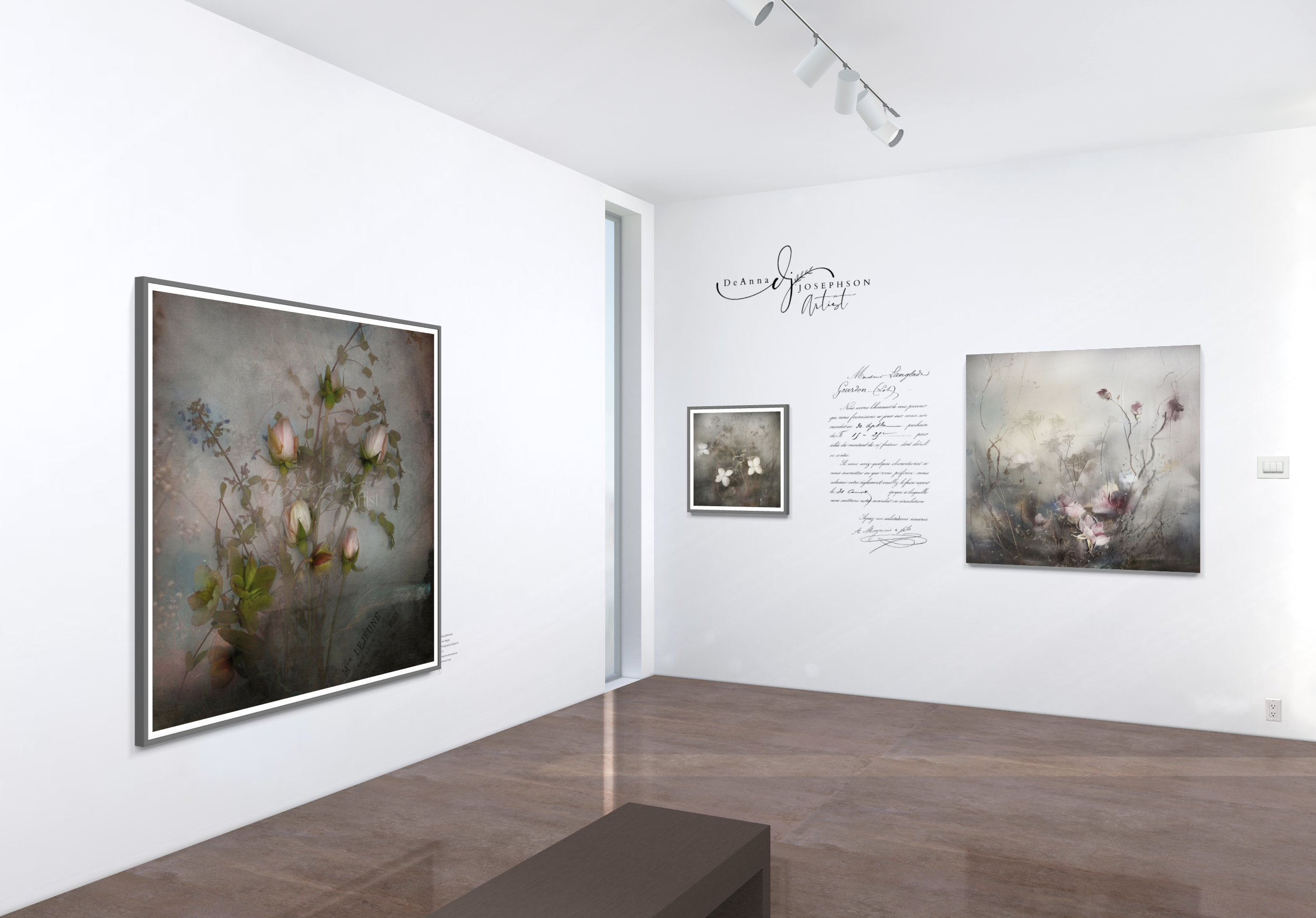
Use wall text in conjunction with graphics for innovative exhibition design. As shown below, Deanna Josephson has utilised our graphics feature to include a logo and own signature flair to her exhibition text.
There are many ways to experiment with wall text in our galleries, either as a title or label, or as an integral part to a work - you choose!